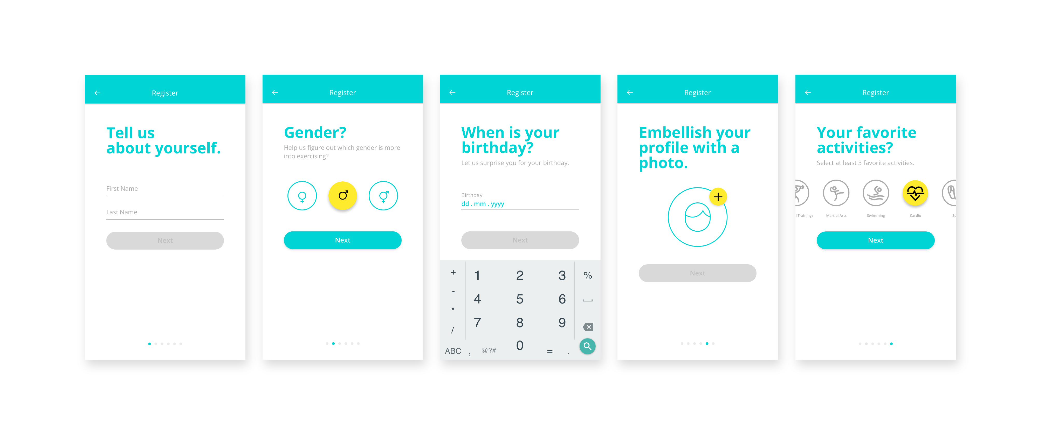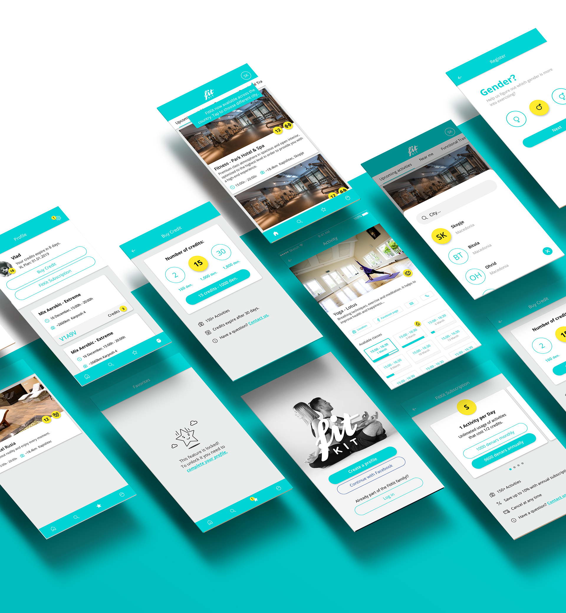

> the core user journey
The main function of the app is booking an activity so the goal was to make this action simple and accessible for the user. In order to successfully accomplish this we developed tree main steps for the core user journey:

Discover an activity!
Scroll throughout different activities & choose one you like.
Scroll throughout different activities & choose one you like.

Learn about it!
See the activity details & timetable with available classes.
See the activity details & timetable with available classes.
Book an activity!
Choose a time most suitable for your schedule & book your next class.
Choose a time most suitable for your schedule & book your next class.